Ever seen two cars claiming the same figures yet one can just pull away? Or ever seen a car claiming less figures but is all over a car claiming more?
I repeatedly hear many tails of joy from repeat customers when they come back about how impressed they are with what their car can compete with and compare with, but they’re surprised because they’re comparing top trumps, which is the peak figures.
Many people see their peak number and instantly decide whether they’re happy or unhappy with the result, but there is far more to the story than this.
Let’s compare 2 Astra J VXR’s one from Rabbid Remaps, another from a third party. Both cars make approximately 400LbFt of Torque and 330HP.
However as I alluded to yesterday many tuners are not aware of nor able to modify a number of ECU limiters which cause the power to dive bomb after 5800RPM. In fact some may just cut your graph off at 6000RPM to hide it.
While peak figures are the same, area under the curve, and the length of the power bands are different. This has a great effect on how a car performs, and how it should be driven to get the optimum out of it.
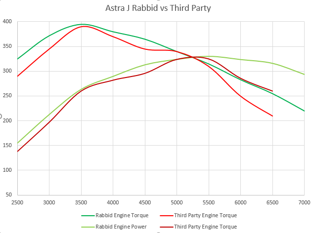
The first image shows the two power and torque curves over laid, as you can see both have pretty similar peaks, but the Rabbid Remaps tune is able to hold power and rev out further without losing it. Green in all images will be Rabbid Remaps and Red will always be the third party tune.
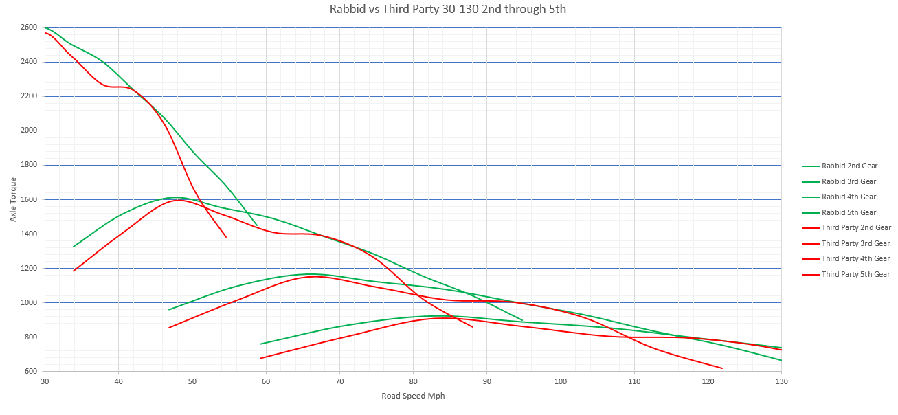
Now move to the second image, this shows how the engines torque is converted through the gear ratios of the gearbox and final drive into an axle torque. This is the torque which is sent to the drive shaft.
The image shows a 30 to 130 run, starting at the left the highest lines are 2nd gear and the ones lowest starting to the right are 5th. The left shows the axle torque level and bottom axis shows the road speed.
Let’s analyse what happens, as soon as the race starts the red tune starts to lose torque around 38mph, at this point the green tune would pull ahead.
Both cars then come onto 400LbFt at the engine peak torque around 45MPH but this is where things start to get interesting.
While the red car starts to lose axle torque again, by 52MPH it has dropped below that of what 3rd gear could produce and in order to remain at it’s best it must shift up to 3rd.
The green car however still is able to produce good torque and at 55Mph there is a clear advantage in axle torque.
Remember torque is what accelerates you, the higher the torque at any road speed the more acceleration is available to you at that road speed.
We can also use image 2 to show the optimum shift points for each car.
Green:
2nd -> 3rd 58MPH
3rd -> 4th 88MPH
4th -> 5th 116MPH
Red:
2nd -> 3rd 52MPH
3rd -> 4th 80MPH
4th -> 5th 108MPH.
Every time you change up a gear, you lose axle torque in order to gain more axle RPM from engine RPM. This is the main reason your car will feel slower each time you go up a gear. You lose acceleration to gain a higher available top speed.
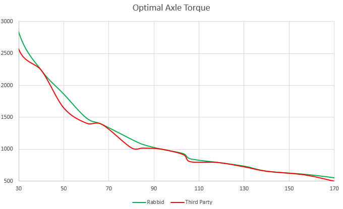
Now look at image 3, from the data we produced in image 2 we can work out the maximum available axle torque assuming you changed at the optimum points.
You can clearly see that the red car, again while having the same peak figures on it’s stats sheet, it indeed shows lower rates of acceleration at many road speeds.
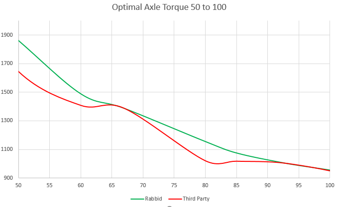
Image 4, shows a zoomed in section from 50MPH to 100MPH, this is an area you’ll spend a lot of time in during a track day or even fast road driving. The difference in maximum available acceleration is clear, at 50MPH and 80MPH there is a big difference.
In reality it’s power band and area under the curve that really matters, not a peak figure. This goes to show that if you’re buying a tuning package or a remap based on just a claimed figure, you could be missing out on potential performance.
We only dyno tune cars because we believe that it’s the only way to ensure we create the best area under the curve reliably. While you can setup cars on the street you cannot ensure that the torque and power curves are smooth, thus we just don’t offer it.